Hello!

Sign In or Register to be able to read everything! Graphic Balloon is a community designed to provide a meeting point for the creative minds. Join. Help. Discuss. Inspire. :)


You are not connected. Please login or register

Graphic Balloon » Advanced Search

Go to page : 1, 2  Next

Search found 27 matches for mimózatutorial

Bunny in Inkscape - Thu Jul 07, 2016 4:02 pm

Bunny in Inkscape
Bunny in Inkscape


Sofware used: Inkscape
Time needed: roughly 11 minutes


Tutorial created by: Mimóza


Mission

Create a animal
(Can be bunny, anything.)


#inkscape #tutorial #mimózacollection #mimózatutorial #howto #video
Search in: 
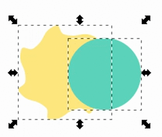
Graphic Design School  Topic: Bunny in Inkscape  Replies: 1  Views: 1108

Simple gradient trick - Wed Jul 06, 2016 6:34 am

Simple gradient trick

Software: any
Time: a minute

Reply to see:

6. DONE

You can play around with several shapes and additions.

Topics tagged under mimózatutorial on Graphic Balloon Rect16523-6-9-0-4-3 Topics tagged under mimózatutorial on Graphic Balloon Rect16523-69-9 Topics tagged under mimózatutorial on Graphic Balloon Text16746-2

If you add a little shadow below a shape that's supposed to be at the top, it will pop out even more. Smile


Tutorial created by: Mimóza

#tutorial #anysoftware #mimózacollection #gradient #pop #3d #mimózatutorial


Mission

Using the gradient trick, create something.
(Button, text)

Search in: Graphic Design School  Topic: Simple gradient trick  Replies: 2  Views: 1218

Inkscape - Tracing an image - Tue Jul 05, 2016 10:07 pm

Inkscape - Tracing an image


Purpose: Turning a raster image into a vector image.
Software used: Inkscape

It can happen you are provided with an image that's not big enough for the design it needs to be used for. (For example a tiny logo image is given that needs to be used on a wallpaper.) In this case you can trace the image and turn it into a vector image that can be zoomed infinitely ( Vector vs. Raster Tutorial )
In Inkscape, there's an option that let you trace an image (there are several other online opportunities for this as well.)
Reply to see:


You can experiment with photos too. (Trace the lineart etc. Just check the Settings provided)
Let's see what the software can do with Barbara Palvin. Smile

Topics tagged under mimózatutorial on Graphic Balloon Image15844 Topics tagged under mimózatutorial on Graphic Balloon G15857 Topics tagged under mimózatutorial on Graphic Balloon Path15875
Topics tagged under mimózatutorial on Graphic Balloon Image15952 Topics tagged under mimózatutorial on Graphic Balloon G15955 Topics tagged under mimózatutorial on Graphic Balloon Path15971
Topics tagged under mimózatutorial on Graphic Balloon Image15915_1 Topics tagged under mimózatutorial on Graphic Balloon G15918 Topics tagged under mimózatutorial on Graphic Balloon G15928


Tutorial created by: Mimóza

#tutorial #inkscape #vector#mimózacollection #tracing #rastertovector #mimózatutorial

Mission

Trace our logo, and post in a bigger size.
(Height: 300px)
Topics tagged under mimózatutorial on Graphic Balloon Padath4a337

Search in: Graphic Design School  Topic: Inkscape - Tracing an image  Replies: 0  Views: 799

Inkscape - Node Tool - Thu Jun 30, 2016 1:42 pm

Inkscape - Node Tool


You can use the Node Tool to modify the shapes you've created preiously.

Topics tagged under mimózatutorial on Graphic Balloon NodetoolF2 - Node Tool

Reply to see:


Tutorial created by: Mimóza

#tutorial #inkscape #vector #mimózacollection #basics #shapes #drawing #mimózatutorial

Mission

Draw a heart.

Search in: Graphic Design School  Topic: Inkscape - Node Tool  Replies: 1  Views: 1213

Inkscape - Path options - Thu Jun 30, 2016 1:24 pm

Inkscape - Path options


Inkscape let you play with the shapes you created. There are different path options that let you merge, cut, cut parts of the object. The options are the following represented with some samples.

Topics tagged under mimózatutorial on Graphic Balloon Inkscape-path-menu-cut-path

Union Ctrl++
Merges the selected objects.
Topics tagged under mimózatutorial on Graphic Balloon Bandicam%202016-06-30%2012-36-20-156
Difference CTRL+-
The overlapped part (upper object) is removed.
Topics tagged under mimózatutorial on Graphic Balloon Bandicam%202016-06-30%2012-36-46-525
Interselection CTRL+*
Leaves the area where the 2 objects overlapped.
Topics tagged under mimózatutorial on Graphic Balloon Bandicam%202016-06-30%2012-36-55-297
Exclusion CTRL+^
Opposite of Interselection.
Topics tagged under mimózatutorial on Graphic Balloon Bandicam%202016-06-30%2012-37-03-599

Division CTRL+/
The overlapping part of the upper object is cut from the one below it.
Topics tagged under mimózatutorial on Graphic Balloon Bandicam%202016-06-30%2012-37-11-755


All the options work with paths drawn with Pen Tool too.


Tutorial created by: Mimóza

#tutorial #inkscape #vector#mimózacollection #basics #shapes #drawing #path #pathoptions #merge #mimózatutorial


Mission

Create a Mickey Mouse head silhouette.
(' big circle, 2 smaller circle, 2 ellipse, 1 ellipse,
Union path option)
Topics tagged under mimózatutorial on Graphic Balloon Path4165-4

Search in: Graphic Design School  Topic: Inkscape - Path options  Replies: 4  Views: 915

Inkscape - Drawing Shapes - Thu Jun 30, 2016 1:11 pm

Inkscape - Drawing Shapes

Reply to see:

Topics tagged under mimózatutorial on Graphic Balloon Ezgif-2754504017Topics tagged under mimózatutorial on Graphic Balloon Ezgif-3093847659


Tutorial created by: Mimóza


#tutorial #inkscape #vector #mimózacollection #basics #shapes #drawing #mimózatutorial

Mission

Draw a simple flower using the shape tools.
Topics tagged under mimózatutorial on Graphic Balloon Path4140


Search in: Graphic Design School  Topic: Inkscape - Drawing Shapes  Replies: 1  Views: 1162

Manga Render Request - Tue Jun 14, 2016 8:17 pm

My try. Razz

Find the image in bigger size, because it's easier to clean it if its bigger. Razz (How to find an image: http://www.graphicballoon.com/t502-tip-how-to-find-a-certain-image)
Topics tagged under mimózatutorial on Graphic Balloon Base
1) Make the picture grayscale
Topics tagged under mimózatutorial on Graphic Balloon Grayscae
2) Make the contrast bigger, so the unneeded details will be lost and the outline will be more clear
Topics tagged under mimózatutorial on Graphic Balloon Bwlighter
3) Render the image (Tutorial how: http://www.graphicballoon.com/t112-selection-tool-basics?highlight=selection)
Topics tagged under mimózatutorial on Graphic Balloon Render
4) Play around a bit more with Highlight/ Midtone/ Shadow settings, till you're satisfied with the result
Topics tagged under mimózatutorial on Graphic Balloon Vwgd


Hope this helps. Very Happy Razz

#Mimózart #graphicrequest #freeraphics #completedbymimóza #mimózacollection #tutorial #minitutorial #mimózatutorial
Search in: Successful Requests  Topic: Manga Render Request  Replies: 8  Views: 2238

How to find a certain image? - Mon Jun 06, 2016 9:36 am

How to find a certain image?

                    
It can happen to any of us we find an awesome image or a requester provides an image, however its quality is poor or smaller than the desired one. In this case, we can try to track down the image and hope for a site that contains it in a bigger size or better quality. 
(Also, it's a great way to spy on people and find out if their image is plagiarized or stolen from somewhere.)

Reply to see:


Tutorial created by: Mimóza

#tutorial #trick #tracking #search #tip #mimózacollection #mimózatutorial
Search in: Graphic Design School  Topic: How to find a certain image?  Replies: 0  Views: 1126

Penguin in Inkscape - Sat Jun 04, 2016 6:55 pm

Penguin in Inkscape
Penguin in Inkscape


Promocean Mascot in 6 minutes
No explanation, Inkscape tutorials coming soon in the future.
Sorry for the awkward youtube music. Topics tagged under mimózatutorial on Graphic Balloon 1f601


Tutorial created by: Mimóza


Mission

Create a animal
(Can be bunny, anything.)

#tutorial #inkscape #mascot #video #penguin #vector #flat #mimózacollection #mimózatutorial #promocean
Search in: Graphic Design School  Topic: Penguin in Inkscape  Replies: 7  Views: 1388

Cut letters creation - Sun May 22, 2016 3:21 pm

Cut letters creation


This is what we are going to create:
Topics tagged under mimózatutorial on Graphic Balloon Pink

Font used: Berlin Sans FB Demi

Reply to see:


Tutorial created by: Mimóza

#tutorial #button #psp #corel #paintshoppro #letter #cut #slash #anysoftware #mimózacollection #mimózatutorial

Mission

Using the method posted in the tutorial,
write out your username.

Search in: Graphic Design School  Topic: Cut letters creation  Replies: 1  Views: 1329

Dodging and Coloring image - Sun May 01, 2016 3:07 pm

Dodging and Coloring image


Topics tagged under mimózatutorial on Graphic Balloon Lightercsaj

Reply to see:


Tutorial created by: Mimóza

#tutorial #blendmode #psp #corel #paintshoppro #dodge #color #coloring #mimózacollection #mimózatutorial

Mission

Reproduce the image on the Tutorial.

Starting one:
Topics tagged under mimózatutorial on Graphic Balloon Base

Search in: Graphic Design School  Topic: Dodging and Coloring image  Replies: 2  Views: 1262

Typography Terms Master - Sat Apr 16, 2016 9:00 am

Typography Terms Master


Credit goes to CreativeBloq for the tutorial.

Topics tagged under mimózatutorial on Graphic Balloon Letteranatomy
A visual guide to some common typography terms - see key below


Key to image: 1. Bowl; 2. Stem; 3. Counter; 4. Arm; 5. Ligature; 6. Terminal; 7. Spine; 8. Ascender; 9. Apex; 10. Serif; 11. Ear; 12. Descender; 13. Crossbar; 14. Finial; 15. Ascender height; 16. Cap height; 17. X-height; 18. Baseline; 19. Descender line


Aesc (phonetic: ash)


A ligature of two letters – 'a' and 'e'. The aesc derives from Old English, where it represented a diphthong vowel, and has successfully migrated to other alphabets including Danish and Icelandic.

Aperture


The constricted opening of a glyph, as seen in the letter 'e'. Varying the size of the aperture has a direct effect on the legibility of a letterform and, ultimately, readability.

Apex


The point at the top of a character where the left and right strokes meet. The example shown here is the top point of an uppercase a.

Arm


A horizontal stroke that does not connect to a stroke or stem at one or both ends – such as the top of the capital T.

Ascender


The part of a lower case letterform that projects above the x-height of the font. Ascenders are important for ease of prolonged reading, though the combination of too much asc

Topics tagged under mimózatutorial on Graphic Balloon ART183.ntk2_.ascender1.jpg1ender-height and not enough x-height can cause problems.
The ascender projects above the x-height of the font

Baseline


The baseline is where the feet of your capital letters sit. Below this line are descenders and loops.

Bowl


The shapely, enclosed parts of letters such as 'p' and 'b'.

Beak


The beak-shaped terminal at the top of letters such as 'a', 'c', 'f' and 'r'.

Bicameral (as opposed to Unicameral)


Bicameral refers to alphabets that have upper and lower case letterforms, such as Roman and Cyrillic – as opposed to the likes of Hebrew and Arabic.

Bracket


A wedge-like shape that joins a serif to the stem of a font in some typefaces.

Cap height


The height of a capital letter above the baseline.

Copyfitting


The job of adjusting point size and letter spacing in a bid to make text occupy its allotted space in a harmonious fashion.

Counter


The enclosed – or partially enclosed – portion of letterforms such as 'c', the lower part of 'e' and 'g'; easy to get mixed up with the bowl.

Crossbar


The crossbar connects two strokes, as in 'H'. Not to be confused with the crossstroke that cuts through the stem of letterforms such as 't'.

Cursive


These are typefaces that imitate handwriting. Ever popular with Joe Public, the design community is often less than thrilled by these sometimes flowery fonts.

Descender


The part of the letterform that falls below the baseline. In lowercase terms, this means 'p', 'y' and 'q', and sometimes applies to uppercase 'J' and 'Q'.

Diacritical


Is it so critical that you might die? No. Diacriticals refer to accents applied to letterforms by languages including French, Czech and German in a bid to enhance the function of the glyph.

Dingbat


Once known as printer's flowers, dingbats are decorative elements that can vary from simple bullets to delicate fauna and flora often formed into themed collections.

Topics tagged under mimózatutorial on Graphic Balloon ART183.ntk2_.dingbats.jpg
Dingbat are decorative elements such as bullets

Display fonts


Any typeface intended to be used in short bursts can be defined as a display font. They're often created just for use at large point sizes, as with headlines and titles.

Drop cap


An oversized capital letter often used at the start of a paragraph that 'drops' into two or more lines of text, but can also climb upwards.

Ear


A small stroke extending from the upper-right side of the bowl of lowercase g, as shown in the example. It can also appear in a lowercase r.

Ethel


A ligature of the letters 'o' and 'e'.

Em


Often referred to as 'Mutton' to distinguish it from the very similar-sounding En, Em is a horizontal space equal to the current point size of text.

En


'Nut' to its friends, the En is a horizontal measure one half the size of an Em. That being the case, 'lamb' might have been more appropriate.

Eye


The eye is similar to a counter, but instead refers specifically to the enclosed part of the letter 'e'.

Finial


A tapered or curved end, which appears on letters such as e and c.

Fleuron


A subcategory of, or the precursor to, the dingbat. Fleurons are floral marks dreamed up by printers of the past to help decorate text.


The HTML5 tag that brings typography to the internet with typefaces directly embedded in web pages.

Glyph


Any singular mark that makes part of a font, whether a letter, number, punctuation mark or even a dingbat. Glyphs are the building blocks of typography.

Topics tagged under mimózatutorial on Graphic Balloon ART183.ntk2_.glyph_.jpg
Glyphs are the singular parts that make up a font

Grapheme


Very similar to glyph, but possibly a bit broader. A grapheme is a fundamental unit of language, such as a Chinese pictogram, an exclamation mark or a letterform. Still with us in our guide to what is typography? Great! Because we've got more terms coming your way!

Gutter


The spaces between facing pages of, and very often columns of text.

Justified


In a paragraph of justified text, the contents are arranged so that there is no white space at the end of a line: each begins flush left and finishes flush right.

Kerning


The art of adjusting the proximity of adjacent letters to optimise their visual appeal and readability.

Leading


Leading describes the vertical space between each line of type. In olden times actual strips of lead were used to separate lines of text vertically; the naming convention persists.

Topics tagged under mimózatutorial on Graphic Balloon ART183.ntk2_.leading.jpg
Leading describes the vertical space between each line of type

Legibility


The ease with which one letterform can be distinguished from the next. It feeds into but is not the same as readability.

Loop


The lower part of the letter 'g' is known as its loop or lobe. Sometimes called the tail – a term that also takes in the lower portion of letter 'y'.

Topics tagged under mimózatutorial on Graphic Balloon ART183.ntk2_.loop_.jpg
The lower part of the letters 'g' and 'y' are known as the loop or lobe

Logotype


The lettered part of any marque or identity. The logotype can be taken separately from its graphic companion.

Ligature


The conjoined but non-identical twins of the typographic universe. Ligatures pull two forms together to produce a new glyph.

Manicule


Also known as the bishop's fist (stop sniggering at the back), the pointing hand symbol is a popular dingbat.

Monospace


Fonts in which every letterform occupies the same horizontal space.

OpenType


Designed by Microsoft and Adobe, OpenType supplanted and improved upon TrueType and PostScript fonts.

Oblique or sloped roman


To be distinguished from italics, in which the letterforms are purposefully drawn to be different to their upright cousins. Oblique letters are merely slanted versions of the standard roman form, often arrived at by mechanical means.

Orphan


The first line of a new paragraph stranded at the bottom of a page. This is considered to be as bad as the name suggests.

Pica


One sixth of an inch in length, the pica is associated with line-length and column width. There are 12 points or 16 pixels in one pica.

Pilcrow


The paragraph symbol, it now marks the presence of a carriage return but at one time is thought to have denoted a change of theme in flowing text.

Point


A standard typographical measurement equal to 1/12 of a pica or 1/72 of an inch.

Readability


Readability refers to the ease with which a block of text can be scanned by eye.

Serif


A flare or terminating flourish at the end of a letterform's strokes believed to originate with the Roman tendency to paint letters onto marble before chiselling them out.

Sidebearing


The horizontal space to either side of a letterform, separating it from other letters.

Spine


The main curved stroke of a lowercase or capital S.

Squoosh


This is the inadvisable process of squashing or expanding a typeface digitally either to fit a space or for visual effect. If you do it, make sure you keep it to yourself.

Topics tagged under mimózatutorial on Graphic Balloon ART183.ntk2_.squoosh.jpg
Squoosh is the process of squashing or expanding a typeface digitally

Spur


A small projection from the curve of a letterform, sometimes known as a beak or a beard. G provides a good example.

Stem


A vertical, full-length stroke in upright characters.

TDC


The Type Directors Club is a typography organisation based in New York.

Tittle


The brilliantly suggestive name for the dot above letters 'i' and 'j'.
Topics tagged under mimózatutorial on Graphic Balloon ART183.ntk2_.tittle.jpg
Tittle is the name for the dot above the i or j

Terminal


A type of curve at the end of a stroke. Examples include the teardrop shapes in: 'finial', 'ball', 'beak' and 'lachrymal'.

x-height


The height of the lowercase x in any given typeface. This delimits the size of the glyph's detail and therefore also of its ascenders and descenders.


Credit: http://www.creativebloq.com/typography/what-is-typography-123652/2

#tutorial #youshouldknow #designerrules #typography #mimózacollection #mimózatutorial #creditedsource
Search in: Graphic Design School  Topic: Typography Terms Master  Replies: 1  Views: 1252

Typography Basic Terms - Sat Apr 16, 2016 8:15 am

Basic Typography Terms


Credit goes to CreativeBloq for the tutorial.

CreativeBloq wrote:
Typography is, quite simply, the art and technique of arranging type. It's central to the work and skills of a designer and is about much more than making the words legible. Your choice of typeface and how you make it work with your layout, grid, colour scheme, design theme and so on will make the difference between a good, bad and great design.


Choosing a font


There are countless free fonts you can use on the web. However, just because you can choose from a vast library doesn't mean you have to; there's something to be said for painting with a limited palette, and tried and tested fonts like Helvetica continue to serve us well.

Topics tagged under mimózatutorial on Graphic Balloon Toomuchfancy


01. Size


All typefaces are not created equally. Some are fat and wide; some are thin and narrow. So words set in different typefaces can take up a very different amount of space on the page.
The height of each character is known as its 'x-height' (quite simply because it's based on the letter 'x'). When pairing typefaces – such as when using a different face to denote an area of attention – it's generally wise to use those that share a similar x-height. The width of each character is known as the 'set width', which spans the body of the letter plus a space that acts as a buffer with other letter.

Same size - different font
Topics tagged under mimózatutorial on Graphic Balloon Samesizedifferentfont


02. Leading


Leading describes the vertical space between each line of type. It's called this because strips of lead were originally used to separate lines of type in the days of metal typesetting.
For legible body text that's comfortable to read, a general rule is that your leading value should be greater than the font size; anywhere from 1.25 to 1.5 times.


Leading 0 - 0.5 - 2

Topics tagged under mimózatutorial on Graphic Balloon 0leading
Topics tagged under mimózatutorial on Graphic Balloon 05leading
Topics tagged under mimózatutorial on Graphic Balloon 2leading


03. Tracking and kerning


Kerning describes the act of adjusting the space between characters to create a harmonious pairing. For example, where an uppercase 'A' meets an uppercase 'V', their diagonal strokes are usually kerned so that the top left of the 'V' sits above the bottom right of the 'A'.
Kerning similar to, but not the same as, 'tracking'; this relates to the spacing of all characters and is applied evenly.


First Row Kerning 0 - 100 - 500
Second Row Tracking 0 - 0.2 - 0.6

Topics tagged under mimózatutorial on Graphic Balloon 0trackkern
Topics tagged under mimózatutorial on Graphic Balloon 10002
Topics tagged under mimózatutorial on Graphic Balloon 50006


04. Hierarchy and scale


If all type was the same size, then it would be difficult to know which was the most important information on the page. In order to guide the reader, then, headings are usually large, sub-headings are smaller, and body type is smaller still.
Size is not the only way to define hierarchy – it can also be achieved with colour, spacing and weight.


Credit: http://www.creativebloq.com/typography/what-is-typography-123652

#tutorial #youshouldknow #designerrules #typography #mimózacollection #mimózatutorial #creditedsource
Search in: Graphic Design School  Topic: Typography Basic Terms  Replies: 0  Views: 1209

Pattern background for Buttons - Sat Apr 09, 2016 9:58 am

Pattern background for Buttons


Use patterns or background to create buttons! Smile
We had some Tutorials about creating buttons. But sometimes you feel a huge block and cannot come up with new designs. At times like these, by using patterns as backgrounds you can use a certain design countless times.

Sample:
Base button:
Topics tagged under mimózatutorial on Graphic Balloon Basewehave


Search for free to use patterns or backgrounds, put them on a new layer, set the Blend mode to "Overlay" and you can see what a difference a well chosen background image can make. Smile


Topics tagged under mimózatutorial on Graphic Balloon Pattern1Topics tagged under mimózatutorial on Graphic Balloon Overlay2
Topics tagged under mimózatutorial on Graphic Balloon Overlay4Topics tagged under mimózatutorial on Graphic Balloon Overlay5
Topics tagged under mimózatutorial on Graphic Balloon Overlay3Topics tagged under mimózatutorial on Graphic Balloon Overlay7
Topics tagged under mimózatutorial on Graphic Balloon Overlay6

Another sample:
Base:
Topics tagged under mimózatutorial on Graphic Balloon Anotherbase
With patterns:
Topics tagged under mimózatutorial on Graphic Balloon Pattern3Topics tagged under mimózatutorial on Graphic Balloon Button3
Topics tagged under mimózatutorial on Graphic Balloon Button2Topics tagged under mimózatutorial on Graphic Balloon Pattern4
Topics tagged under mimózatutorial on Graphic Balloon Button5

When adding a pattern as background, make sure the added text is clear and readable.


Sample text:

Topics tagged under mimózatutorial on Graphic Balloon Withtext


Tutorial created by: Mimóza

#tutorial #button #psp #corel #paintshoppro #button #pattern #rank #mimózacollection #mimózatutorial


Mission

Create a set of rank images,
using patterns.

Search in: Graphic Design School  Topic: Pattern background for Buttons  Replies: 3  Views: 1357

Hue - Saturation - Sun Apr 03, 2016 9:13 am

Hue - Saturation
Hue - Saturation

Now we'll get familiar with the Hue and Saturation basics in Corel Paint Shop Pro.


The Hue option is very useful when you want to change the color of something. Very Happy

Let's say, you create a purple rank. In a click you can change its color to any other color and don't have to re-create the whole design.

Sample purple button:
Topics tagged under mimózatutorial on Graphic Balloon Alap

Adjust/ Hue and Saturation/ Hue/ Saturation Lightness (Shift + H)
Reply to see:


Tutorial created by: Mimóza

#tutorial #psp #corel #paintshoppro #anysoftware #mimózacollection #mimózatutorial #saturation #vibrancy

Mission

Take a screenshot of our forum,
and using the hue tool turn it vibrant purple.

Search in: Graphic Design School  Topic: Hue - Saturation  Replies: 0  Views: 1093

Search found 27 matches for mimózatutorial

Go to page : 1, 2  Next

Back to top